Ember theme
Service

Brand Identity & Logos.

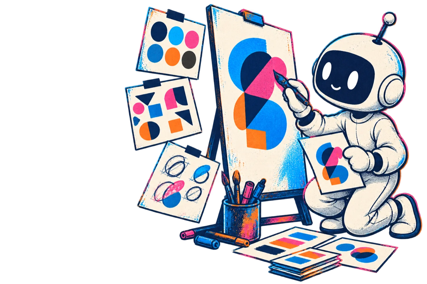
Logos and complete brand systems built to work at scale. AI agents iterate through many concepts under a designer's direction, and the finalists are redrawn by hand as original vector artwork.

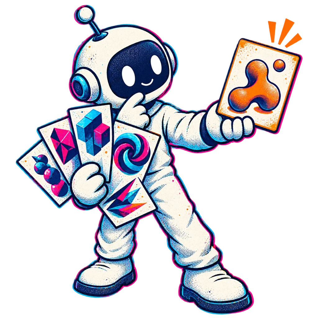
A QQuantum maker crafts an abstract identity system.
Last reviewed 4 September 2026 · Engineering guidance, not legal advice.
IDENTITY CAPABILITIES
01

Timeless Marks

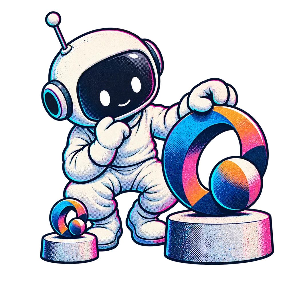
A QQuantum maker tests an abstract mark at different sizes.
We don't chase trends. We design marks built for recognition and legibility at every size, from favicon to billboard.
02

Massive Iteration

A QQuantum maker compares abstract mark studies.
AI lets us explore far more visual directions in the time an agency takes to present three, so the shortlist comes from a real search rather than a first idea.
03

Comprehensive Guidelines

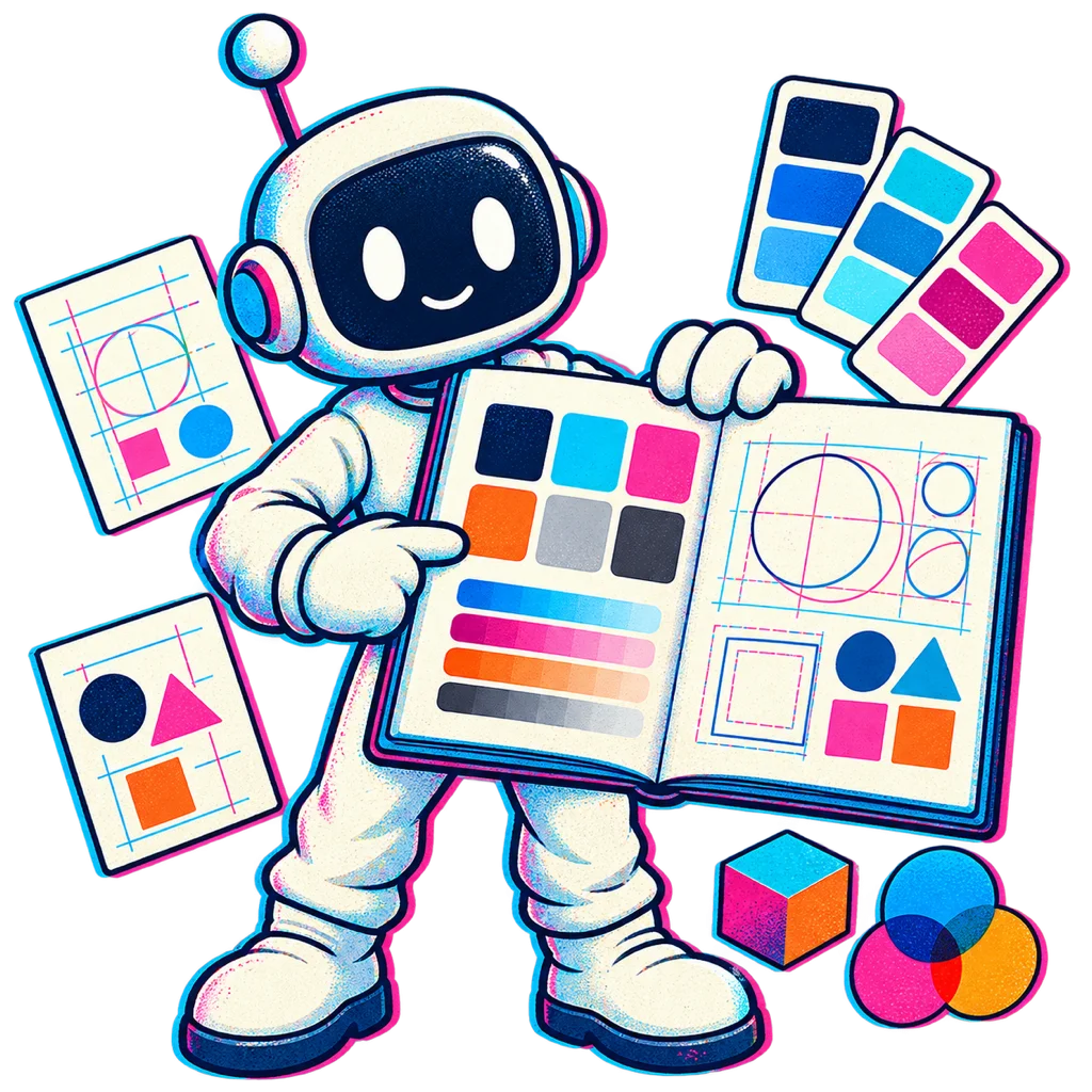
A QQuantum maker opens a visual identity guide.
Delivery includes extensive brand guidelines covering typography, color palettes, spacing, and application to ensure brand consistency.
04

Built For Many Markets

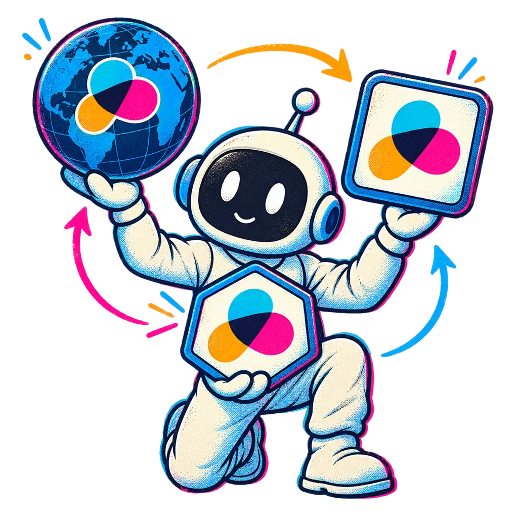
A QQuantum maker checks an abstract mark across several contexts.
Every direction is screened for cross-language legibility and for meanings that do not travel — designed for the markets you actually operate in.
ANALYSIS

Why broad AI exploration under human direction produces stronger marks

A great logo is not a lucky sketch — it is the survivor of a brutal elimination process. Traditional agencies present three directions because three is all a human team can produce in a sprint, which means your identity is chosen from a statistically tiny sample of what it could have been. Our approach removes that ceiling: AI agents iterate through many concepts, and a designer eliminates everything that is merely fashionable, derivative or fragile.

What survives is engineered, not just drawn. Every finalist is redrawn by hand as original vector artwork — which is both better craft and the reason the deliverable is not a generated image with an uncertain copyright status. Each one is then stress-tested: reduced to a favicon, simulated on fabric and in single-colour print, animated, placed beside competitors on a crowded shelf. We test for recognition, for meanings that do not travel between markets, and for the structural simplicity that keeps a mark legible as trends move.

The identity you receive is a complete operating system for your brand, not a logo file. Comprehensive guidelines document typography, color palettes, spacing systems, photographic direction and application rules across digital and physical media — so every future designer, marketer or AI agent that touches your brand produces work that is unmistakably yours. And because our style-training service can encode your finished identity into a dedicated model, brand consistency scales with your output instead of eroding under it.
HOW IT DEPLOYS
PHASE 01

Strategy & territory

We define your brand's positioning, audience and visual territory before a single mark is generated.

PHASE 02

Explore & eliminate

AI agents iterate through many concepts; a designer curates the survivors and redraws the finalists by hand as original vector artwork.

PHASE 03

Systematize

The final mark ships inside complete guidelines — typography, color, spacing, application — ready for global rollout.

DESIGN TARGETS
1000+
CONCEPTS EXPLORED PER MARK
3wk
STRATEGY TO FULL IDENTITY
1
WRITTEN ASSIGNMENT ON DELIVERY
100%
FINALISTS REDRAWN BY HAND

Properties we design and build to, not measured client outcomes.

QUESTIONS
QUESTIONS — 6

A complete system: the primary logo with variants (horizontal, stacked, monogram, favicon), full color palette, typography hierarchy, spacing and layout rules, photographic and illustration direction, and application examples across digital and print. Everything is documented in comprehensive brand guidelines your team can operate from immediately.

AI is used for breadth, not judgment. Our agents generate many concept directions inside a visual territory defined by our lead designer, who eliminates anything derivative or trend-bound and redraws the strongest candidates by hand as original vector artwork. Volume widens the search; human direction and hand redrawing are what make the survivor distinctive — and original.

A typical engagement runs two to four weeks: strategy and visual territory in week one, exploration and curation in week two, refinement and full guideline production in weeks three to four. Logo-only projects can complete faster; multi-market enterprise systems with extensive applications may take longer.

Yes. Brand evolution is often smarter than revolution — preserving accumulated recognition while modernizing the mark, tightening the system and extending guidelines for digital-first use. We audit your current identity's equity first, then recommend the smallest change that achieves your goals.

You receive a written assignment of all rights we hold in the final identity, plus vector sources, every export format and the guideline document. Two things we will not overstate. First, our visual-similarity screen during exploration reduces obvious conflicts but is not a trademark clearance search: it does not check registers by class and jurisdiction, and you should commission a clearance search from a trademark attorney before adopting or filing. Second, purely AI-generated imagery may attract limited or no copyright protection in some jurisdictions, which is why every finalist is redrawn by hand as original vector artwork. This is engineering and design guidance, not legal advice.

It is a design constraint from the first round rather than a late check. Every direction is screened for cross-language legibility, for gestures and forms that carry unintended meaning in particular markets, and for how the mark reads at small sizes in non-Latin typographic settings. We design for the markets you name; where a market is unfamiliar to us we say so and recommend a local review.

Keep reading
30-minute technical call · no deck

Forge a
legacy.

A distinctive mark and a complete brand system, drawn to last and documented so your team can run it.

CASE STUDIES

Shipped work.
Go and check it.

The work we can name, with the live site, our scope and the boundary made explicit. Select a project to see the evidence; each is a full case study, not a logo or a claim.

sonora.com
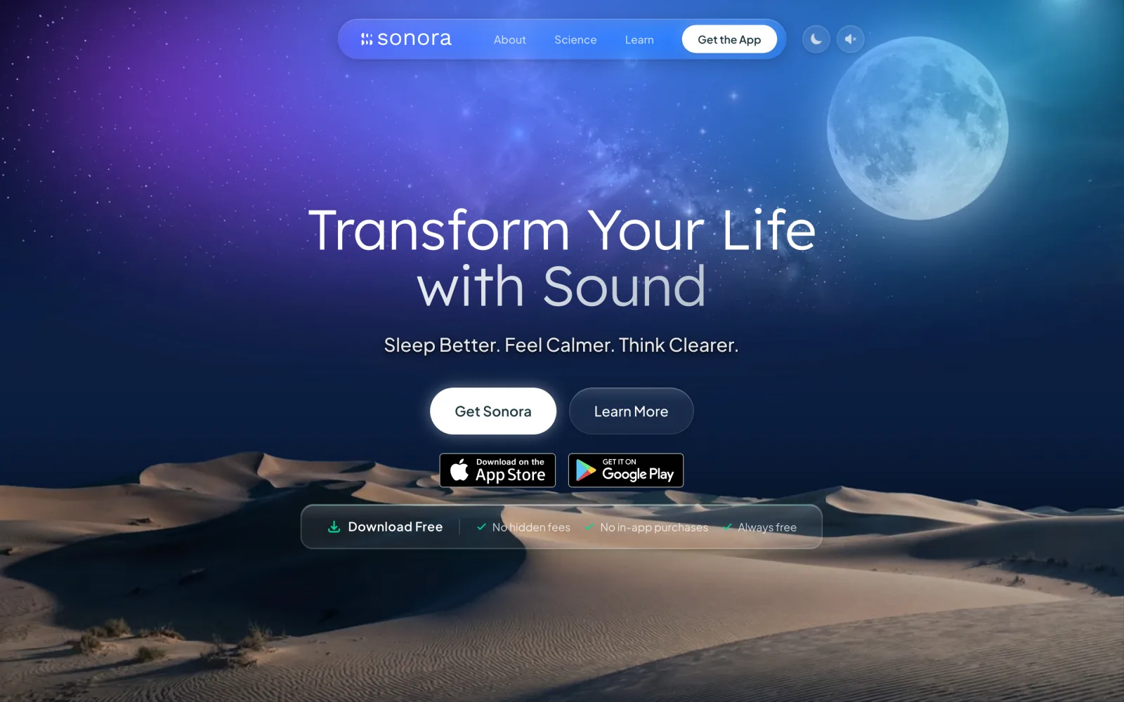
The Sonora homepage on desktop: a full-bleed dune landscape behind the headline “Transform Your Life with Sound”, with App Store and Google Play download buttons.
sonora.com — homepage, 1440×900 sonora.com →
Live Consumer wellness · Mobile + web

Sonora

Cognitive AI Ltd · 2026

A free sound-wellness app, described by its publisher as AI sound therapy that reads a short vocal sample at the start of a session and generates a soundscape for that moment. We designed and built the website and its backend, produced assets for the iOS and Android apps, and supported the application prototype.

Read the case study →

See every published project →

WHO WE HAVE BUILT FOR

Twenty-one years of applications, platforms and campaigns for names you know.

See all of our work →